Covid-19 Cases and Deaths by Continent, Part 3 (Updated with August 2021 Data)
With the rollout of Covid-19 vaccines now being underway in many countries, it seems like a good time to have a large-scale retrospective look at how the pandemic developed in various parts of the world. There are many ways to categorize the world, each with their own advantages and disadvantages, but the continental scale is a fairly natural choice to make. So, I propose to use that perspective in the graphs and text below.
An earlier blog looked at case counts. This blog will focus on deaths, though the data on case counts will still be examined, as the two phenomena are obviously linked. That includes some graphs on Case Fatality Rates by continent.
This will be primarily a descriptive analysis for now, at the continent level. Later I will try some correlations and cluster analysis (i.e. what variables correlate with high case counts or generate clusters (groups with similarity) at the continental and/or national level.
I will keep most of my earlier comments in this update for the benefit of those who haven’t seen the earlier versions, adding the data for July 3 to August 4, 2021 in bold italics. There are many interesting new results, but for those already familiar with the data from previous blogs, perhaps the most interesting new findings are at the end, in the section called “Vaccinations and the Delta Variant”.
I have repeated that section at the front of the blog, to highlight it for those already familiar with the background “by continent” data and analysis.
Vaccinations and the Delta Variant, by Continent
· There is something of a consensus that the Delta variant that has evolved is fairly contagious, but has far less severe effects that the earlier versions of the virus. The rise in cases, without the corresponding rise in deaths in North America and Europe tends to support that proposition, as shown in the first graph.
· There is also research that indicates that, as well as preventing infections, vaccinations lessen the severity of Covid when the virus does “break through” the vaccination wall, as shown in the second graph.

· The graph above quantifies the relationship between cases and deaths for the latest time period. The orange line represents the situation where the rise in cases and rise in deaths are exactly proportional. For points below the line, the rise in cases is higher than the rise in deaths. For points above the line, the converse is true.

·
The second
graph shows how in the areas with the highest vaccination rates (North America
and Europe), the rise in deaths has been about one-third times as great as the rise
in cases. Some part of this may be due
to the usual time lag in deaths vs cases, but most of it probably represents
the lowered severity of the virus in highly vaccinated populations.
· Asia and South America are slightly below the line of proportionality in the first graph, while Africa is slightly above. Large parts of these areas had relatively low vaccination rates during this period. The second graph shows how the relatively low vaccination rates impact these rates.
Australasia is an odd outlier, with death rates increasing nearly twice as fast as case counts. However, given its small population, the numbers of deaths and cases tend to be low, and therefore not as reliable (in a statistical sense) as the data for the much more populated regions. During this period, Australia also had a relatively low vaccination rate, as shown in the second graph.
Aggregate Cases and Deaths, up to August 2021
1 - Raw Numbers of Aggregate Cases and Deaths


The graphs of aggregate case counts and deaths are shown above, for the various continents at different points in time. Note that the graphs have not been normalized for population or any other relevant factors, they just show the raw totals for cases and deaths. Further on, they will be normalized by population.
The graphs indicate that Asia has had the most cases, but is ranked fourth for deaths. That said, its deaths have increased at a higher rate than most of the others during the most recent period (July 2021), so that it very near to overtaking North America for third rank now.
On the other hand, South America is mid-way down the graph for cases, while near the top for deaths. This trend continued during July, so that it is now very close to surpassing Europe in total Covid related deaths.
Europe and North America are high for both cases and deaths. During recent months, however, their curves have flattened, especially the count of total deaths. This would seem to indicate that their high vaccination rates are having a significant effect, especially in reducing deaths.
Africa and Australasia have had relatively low case counts and numbers of deaths. Africa’s rates do seem to have picked up in recent months, however.
The classic sigmoid, or S-shapted curves, of Europe and North America indicate that the pandemic is near its end in those areas, short of a new variant that is not affected by the current vaccines. This appears to apply to both cases and deaths. At this point the new variants appear to be under control, via the vaccinations, with severe outcomes such as death particularly well controlled by the vaccines. It does appear that North America has done a bit better than Europe in recent months, however.
The continuing upslope of most of the other regions indicate that the virus still has a substantial uninfected and unvaccinated pool of potential hosts in these regions. Vaccination rates are still relatively low in many countries of these regions, so things may improve substantially once vaccinations are widespread. This effect may be showing up in the South American data during the most recent month, where the curve for deaths has noticeably flattened.
Of course it should be noted that there is a good deal of uncertainty in these numbers, due to differences in reporting standards and levels of economic development. Climate factors may also be playing a role (i.e. it is now summer in the north, winter in the south). Nonetheless the big picture view seems to be valid.
2 - Aggregate Cases and Deaths per Million Population


Case and death counts alone don’t tell the whole story. Naturally regions with larger populations will experience higher case counts and deaths, all things being equal. But the evidence shows not all things are equal. When an adjustment for population is made (expressing the data as Cases per Million Population and Deaths per Million Population), things are quite different:
· The case count data appears to break into two main groups:
o South America/North America/Europe are in a high case count per million group.
o Asia/Africa/Australasia are in a low case count per million group.
o That said, it could be argued that Asia is actually somewhat intermediate between the high and low groups, and that South America is in the process of breaking away, into a separate very high case count per million range.
· The deaths count data are similar:
o South America/North America/Europe are in a high deaths per million group, though it could be argued that South America has actually broken far enough from that group to constitute a “very high group” all on its own. Though during the most recent month its death rate has turned down, it is still growing at a faster clip than the death rates in Europe and North America, resulting in its gap from the other two continuing to grow.
o Asia/Africa/Australasia are in a low deaths per million group. Asia is now more firmly in the low deaths group than it was in the low case count group.
· The members of the high group had quite similar case count trajectories, until spring of 2021, when the European and North American count increase decelerated, while the South American case count continued on a linear path. This was also true of deaths, though the South America death count graph is much steeper than the case count graph. South America’s trajectory has moderated somewhat in the last month, however.
· As noted, Asia appears to have broken away from the low case group, but that trend is not so obvious for the low death count group.
· Africa and Australasia have both maintained low trajectories, with Africa being the somewhat higher of the two, in both cases and deaths.
Case Count and Deaths by Time Periods to Aug 2021
3 - Raw Numbers per Interval


Here are a couple of graphs, looking at case counts during particular intervals. They are little “busy”, but that is just how analyzing data can be sometimes. Here are some observations, to help the analysis:
· Asia was hit early, peaking in late 2020, then beginning a decline which was interrupted by a new wave in spring 2021. That late surge then dropped off by July, but has bounced back part way by August 2021. Presumably this is the Delta variant, which was first seen in India. This was true for both cases and deaths, though the effect of the late surge was less noticeable for deaths than cases.
· Europe was also hit early, plateaued for a while, then rose quickly and peaked in early 2021. It then came down steadily. The situation was similar for both cases and deaths, though deaths were unusually high at the start of the pandemic. As with Asia, there has been something of a bounce-back in the most recent month, though the effect has been much more prominent in cases than deaths. Presumably, this is an indication that the Delta variant has spread to Europe, but has resulted in relatively few deaths in this quite highly vaccinated population.
· In terms of cases, North America had numbers similar to Asia at the start, but then shot up in a similar matter to Europe, peaked in early 2021 and fell off thereafter. The early death counts were also unusually high, at least compared to Asia. As with Europe, there has been a bounce-back in cases during the most recent month, though deaths have continued to fall. Again, this seems to indicate Delta’s relatively mild effect on a highly vaccinated population.
· For cases, South America’s path was similar to North America up until Autumn of 2020, then plateaued at that middle-high level and stayed there. However, the death counts line showed a very steep increase in the last month or two, while the case count line remained fairly flat. This appears to have turned around within the past month, with cases falling somewhat and deaths falling dramatically.
· Africa remained at relatively low level for the duration, compared to the other large continents. There was a bump in deaths in March, though that seems to have resolved itself. However, in the past two months, things have taken a turn for the worse, in both cases and deaths.
·
Australasia’s case count barely shows up at this
scale, a result of both low counts and a low population.
4 - Case Count and Deaths per Million Population per Day by Time Periods


As with the aggregate counts, expressing the numbers as Cases per Million Population per Day brings out some very different aspects of the world-wide pandemic. Since the time periods in the graph were not equal in duration, this normalizes them to a “per day” basis. Similarly, since the continents are not equal in population, this normalizes them to a “per million population” basis. So, for purposes of comparison, this is the preferred graph. Some comments:
· Asia actually had rather low case counts per million population per day for most of the pandemic period. It had a fairly large uptick in spring 2021, but that still was fairly minor compared to most other regions. This was true for both cases and deaths. During the most recent month, cases per million per day ticked up a bit, though deaths barely changed during that time.
· Europe really got hit quite badly overall, but the really big pandemic didn’t start until autumn 2020. It then exploded, peaked in early 2021 and fell off steadily throughout 2010, to what now seem to be relatively low levels. This was true for both cases and deaths. Similar to Asia, cases per day per million population have increased in the most recent month, though deaths have not had a corresponding rise.
· North America had an experience broadly similar to Europe, though it did get hit earlier, peaked at a higher rate, then fell off more quickly. The run-up in deaths lagged (came later) than the runup in cases. As with Asia and Europe, cases were up in the most recent month, but deaths didn’t rise in tandem (in fact they fell somewhat).
· South America had a steady increase throughout the pandemic period, and still hasn’t peaked. Its numbers are now at about the same level as those of North America and Europe, when they peaked. The recent situation is particularly bad for deaths per million per day, which more than doubled in the most recent month, while cases were only up by about 10% during that period. During the most recent month, both cases and deaths per million per day were both down substantially, deaths particularly so.
· Africa has not been hit very hard at all, relative to the other continents. However, there has been an uptick in both cases and deaths per million per day during the past month.
· The same is true of Australasia. The past month has seen a rise in cases per million per day during the past month, though deaths have not increased noticeably.
5 - Case Fatality Rates by Continent and Time Periods


Of particular interest is the trajectory of the case fatality rates for different areas of the world. I have defined this as (deaths/cases), with deaths lagging cases by about 2 weeks, as it takes some time for the disease to progress to the end-point of death.
The data is shown in the two graphs above. The second graph is the same as the first one, with Australasia taken out. Because it had very low numbers of cases and counts, especially during some time intervals, the case fatality rate can swing around rather wildly (this is a general problem whenever analyzing data with small numbers). So, it is best to exclude that data and focus on the second graph.
Here are some observations:
· The general trend was clear: case fatality rates were high at the start of the pandemic, dropped quite quickly and basically plateaued in the middle, then moved back up somewhat, near the end. In the past month, however, the case fatality rate has come back down in all areas of the world other than Africa and Australasia.
· The initially high rates might be an artifact of reporting. At the beginning it was easier to identify deaths than cases (until widespread testing became available).
· The drop-off in lethality during the middle period is similar to what has been seen in many other previous pandemics. Past pandemics have tended to see reductions in severe outcomes as time goes on, though often rates of infection increase at the same time. Evolution experts explain this as a natural result of the disease organism adapting to the host, as the host adapts to the organism (i.e. the disease organism doesn’t really “want” to kill the host, it would rather coexist). There is still some controversy over this hypothesis, however.
· Non-intuitively, the uptick at the end might be due to the increasing vaccination rates. The idea here is that the vaccinations are protecting most people, but the virus is still getting through to those with the least effective immune systems. Thus, those who do become infected are more likely to die. It could also be that the vaccination-hesitant populations are more susceptible to severe outcomes, perhaps due to older ages, underlying medical conditions or lifestyle choices. There doesn’t seem to be a lot of discussion of this effect, yet it does seem to be quite widespread when looking at the situation on the continental scale. As noted above, this uptick seems to have now reversed itself in most regions of the world.
· The graph includes a thicker line for “World”, which gives the case fatality rate averaged over the world. This does seem to indicate that the late uptick in case fatality rates is a real effect, though made less alarming by the fact that case rates have fallen in many continents, and thus deaths have fallen in these places as well, even as the case fatality rate has had an uptick. Fortunately, the worldwide increase in the Case Fatality Rate seems to have been temporary, reversing in the July to August data.
Summary Comments (updated with April 2021 data)
Here are a few observations that seemed to be of the most interest:
Highly Impacted Regions vs Relatively Low Impact Regions
· The graphs in Section 2, Aggregate Cases and Deaths per Million Population show a very obvious divergence between areas that have high infection and death rates from Covid-19 (Europe, North America, South America) and those with relatively low rates (Asia, Africa, Australasia), once the data was adjusted for population.
· This is probably somewhat contrary to many peoples intuition, especially the idea that Asia hasn’t been that hard hit. That is probably because various regions in Asia have been “hot spots”, which make dramatic TV and news reports, and thus have had a lot of media exposure.
· Also, the disease (apparently) began in Asia, so there may be a psychological anchoring effect, whereby the originating location is always “top of mind”. For example, the data indicates that China has experienced a relatively low impact from Covid (in terms of cases and deaths, though not necessarily different types of social disruption), yet many people probably assume that China has actually been severely affected by the pandemic.
South America Hit Hard
· On the other hand, South America’s very high infection and death rates, relative to population, is likely surprising to many people. This is probably due to South America’s fairly peripheral geographical, cultural and media position in the world – it just tends to be overlooked. Also, the pandemic there is still very “hot”, while in other places it has largely cooled off. So, there may be a Covid-19 fatigue effect in most of the world – people may just be tired of hearing about Covid by now.
· It does appear that South America’s pandemic may be receding now, particularly in terms of deaths. However, it is too early to be sure of this trend. Also, a virus that mutates as quickly as Covid is intrinsically hard to predict.
Old World vs New World
· In some ways this looks like an “Old World” vs “New World” effect. Perhaps it reflects the fact that populations in the New World had less exposure to the virus or to some precursor virus that gave relative immunity to the Old World populations. However, the inclusion of Europe in the new world group and Australasia in the old world group cloud that picture. It is noteworthy that this divergence is greater for deaths than for cases, which might be expected if some type of differential natural immunity is playing a role.
· However, the most recent data indicates that case fatality rates have begun to fall in tandem over much of the Old World and New.
East vs West
· The other possibility is an East vs West effect. In that case, any precursor virus might have given some immunity to those in the eastern part of Eurasia but not in the western part or in the New World. The Caucasus mountain ranges do present a fairly formidable natural barrier. Again, the divergence is greater for deaths than cases, which might be expected if some type of differential natural immunity is playing a role.
· As with the Old vs New World data, there does now seem to be some convergence here, as well.
Levels of Globalization and the Pandemic
· It could also represent a split between highly globalized parts of the world (in the sense of large scale tourism, business travel and migration) and less globalized parts. That has some merit, though one doesn’t necessarily think of South America as being more highly globalized than Asia. Nonetheless, there is a lot of north-south migration within the Americas, which could be a significant vector for the pandemic.
· The timing of events do tend to support the globalization hypothesis, with Asia being hit first though not all that hard (apparently the originating region), then the virus spreading to the highly globalized regions of Europe and North America (where it had a much greater effect) and finally slowly spreading to South America. The upticks in Africa and Australasia (relatively isolated regions) are consistent with that hypothesis, though they are still far too small to be definitive.
· The most recent month’s data show a continuing uptick in Africa and Australasia, which would tend to support the globalization hypothesis. It could be said that these regions were “late to the party”, due to their relative geographic and/or economic isolation from the epicenters of globalization.
Genetics
· There may be some sort of genetic effect at work, as it seems to have hit areas with significant Indo-European populations hardest of all. However, within these regions, there were no strong genetic differences between ancestry groups, as far as I know. This is obviously highly speculative and likely to be very controversial, so I will just leave it at that.
· Again, the recent increases in Covid in Africa would tend to indicate that most or all of the world’s major population groups are quite susceptible to the virus.
Late Uptick in Case Fatality Rates and its Reversal
· Though not all regions saw a late uptick in case fatality rates, the majority did. When aggregated at a world-wide level, the late uptick is also obvious. This may be a result of vaccination programs preventing deaths in all but the most vulnerable (most likely in my opinion), or it may be an indication of a more lethal strain of the virus beginning to assert itself (let’s hope not).
· As noted previously, the bump in case fatality rates seems to have been a temporary effect, with rates falling back to previous levels.
Vaccinations and the Delta Variant
· There is something of a consensus that the Delta variant that has evolved is fairly contagious, but has far less severe effects that the earlier versions of the virus. The rise in cases, without the corresponding rise in deaths in North America and Europe tends to support that proposition.
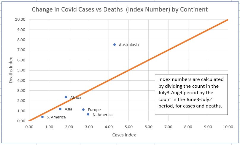
·
The graph
above quantifies the relationship between cases and deaths for the latest time
period. The orange line represents the
situation where the rise in cases and rise in deaths are exactly
proportional. The text box in the graph describes how the index numbers were calculated. When a point is exactly on the
line, it means that cases and deaths are both changing at the same rate
(i.e. the case fatality rate remains unchanged). For points below the line,
the rise in the index for cases is higher than the rise in the index number for deaths. For points above the line, the converse is
true.
· For the areas with the highest vaccination rates (North America and Europe), the rise in the index number for cases has been about 3 times as great as the rise in the index number for deaths. Mathematically, this implies that the case fatality rate is dropping, or equivalently that the disease is becoming less severe in its consequences. Some part of this may be due to the usual time lag in deaths vs cases, but most of it probably represents the lowered severity of the virus in highly vaccinated populations.
· Asia and South America are slightly below the line of proportionality, while Africa is slightly above. Large parts of these areas had relatively low vaccination rates during this period.
· Australasia is an odd outlier, with index numbers for death rates increasing about twice as fast as index numbers for case counts. However, given its small population, the numbers of deaths and cases tend to be low, and therefore not as reliable (in a statistical sense) as the data for the much more populated regions. During this period, Australia also had a relatively low vaccination rate.
In a subsequent blog, I plan to have a deeper look at the differences in Covid deaths and Case Fatality Rates among the countries and continents of the world.
Sources:
https://www.worldometers.info/coronavirus/#countries
https://github.com/owid/covid-19-data/tree/master/public/data/vaccinations
Some earlier Covid-19 blogs:
https://dodecahedronbooks.blogspot.com/2021/07/covid-19-cases-by-continent-jan-2000-to.html
https://dodecahedronbooks.blogspot.com/2021/03/covid-19-vaccines-how-successfully-are.html
https://dodecahedronbooks.blogspot.com/2020/12/covid-19-vaccines-comparison-of.html
https://dodecahedronbooks.blogspot.com/2020/09/covid-19-continues-to-travel-around.html
https://dodecahedronbooks.blogspot.com/2020/07/has-covid-19-become-less-deadly.html
https://dodecahedronbooks.blogspot.com/2020/07/july-2020-update-covid-19-death-rates.html
https://dodecahedronbooks.blogspot.com/2020/05/covid-19-death-rates-correlate-highly.html
https://dodecahedronbooks.blogspot.com/2020/06/covid-19-impact-on-employment-no-impact.html
https://dodecahedronbooks.blogspot.com/2020/04/is-there-model-that-can-predict-when-to.html
https://dodecahedronbooks.blogspot.com/2020/03/estimating-fatality-rate-of-coronavirus.html
=====================================================
And, here’s a more pleasant travel story than anticipating the worldwide journey of a virus.
A Drive Across Newfoundland

U.S.: https://www.amazon.com/dp/B07NMR9WM8
U.K.: https://www.amazon.co.uk/dp/B07NMR9WM8
Germany: https://www.amazon.de/dp/B07NMR9WM8
Japan: https://www.amazon.co.jp/dp/B07NMR9WM8
Canada: https://www.amazon.ca/dp/B07NMR9WM8
Australia: https://www.amazon.com.au/dp/B07NMR9WM8
India: https://www.amazon.in/dp/B07NMR9WM8
Newfoundland, Canada’s most easterly province, is a region that is both fascinating in its unique culture and amazing in its vistas of stark beauty. The weather is often wild, with coastal regions known for steep cliffs and crashing waves (though tranquil beaches exist too). The inland areas are primarily Precambrian shield, dominated by forests, rivers, rock formations, and abundant wildlife. The province also features some of the Earth’s most remarkable geology, notably The Tablelands, where the mantle rocks of the Earth’s interior have been exposed at the surface, permitting one to explore an almost alien landscape, an opportunity available on only a few scattered regions of the planet.
The city of St. John’s is one of Canada’s most unique urban
areas, with a population that maintains many old traditions and cultural
aspects of the British Isles. That’s true of the rest of the province, as well,
where the people are friendly and inclined to chat amiably with visitors. Plus,
they talk with amusing accents and party hard, so what’s not to like?
This account focusses on a two-week road trip in October 2007, from St. John’s
in the southeast, to L’Anse aux Meadows in the far northwest, the only known
Viking settlement in North America. It also features a day hike visit to The
Tablelands, a remarkable and majestic geological feature. Even those who don’t
normally consider themselves very interested in geology will find themselves
awe-struck by these other-worldly landscapes.
A Ride on the Kettle Valley Rail Trail: A Biking Journal Kindle Edition
by Dale Olausen(Author), Helena Puumala(Editor)

The Kettle Valley Rail Trail is one of the longest and most scenic biking and hiking trails in Canada. It covers a good stretch of the south-central interior of British Columbia, about 600 kilometers of scenic countryside. British Columbia is one of the most beautiful areas of Canada, which is itself a beautiful country, ideal for those who appreciate natural splendour and achievable adventure in the great outdoors.
The trail passes through a great variety of geographical and geological regions, from mountains to valleys, along scenic lakes and rivers, to dry near-desert condition grasslands. It often features towering canyons, spanned by a combination of high trestle bridges and long tunnels, as it passes through wild, unpopulated country. At other times, it remains quite low, in populated valleys, alongside spectacular water features such as beautiful Lake Okanagan, an area that is home to hundreds of vineyards, as well as other civilized comforts.
The trail is a nice test of one’s physical fitness, as well as one’s wits and adaptability, as much of it does travel through true wilderness. The views are spectacular, the wildlife is plentiful and the people are friendly. What more could one ask for?
What follows is a journal of two summers of adventure, biking most of the trail in the late 1990s. It is about 33,000 words in length (2 to 3 hours reading), and contains numerous photographs of the trail. There are also sections containing a brief history of the trail, geology, flora and fauna, and associated information.
After reading this account, you should have a good sense of whether the trail is right for you. If you do decide to ride the trail, it will be an experience you will never forget.
Amazon U.S.: https://www.amazon.com/dp/B01GBG8JE0
Amazon U.K.: https://www.amazon.co.uk/dp/B01GBG8JE0
Amazon Germany: https://www.amazon.de/dp/B01GBG8JE0
Amazon Canada: https://www.amazon.ca/dp/B01GBG8JE0
Amazon Australia: https://www.amazon.com.au/dp/B01GBG8JE0
On the Road with Bronco Billy

Spring is on us now, and that brings on thoughts of ROAD TRIP. Sure, it is still a bit early, but you can still start making plans for your next road trip with help of “On the Road with Bronco Billy”. Sit back and go on a ten day trucking trip in a big rig, through western North America, from Alberta to Texas, and back again. Explore the countryside, learn some trucking lingo, and observe the shifting cultural norms across this great continent. Then, come spring, try it out for yourself.
Amazon U.S.: http://www.amazon.com/gp/product/B00X2IRHSK
Amazon U.K.: http://www.amazon.co.uk/gp/product/B00X2IRHSK
Amazon Germany: http://www.amazon.de/gp/product/B00X2IRHSK
Amazon Canada: http://www.amazon.ca/gp/product/B00X2IRHSK